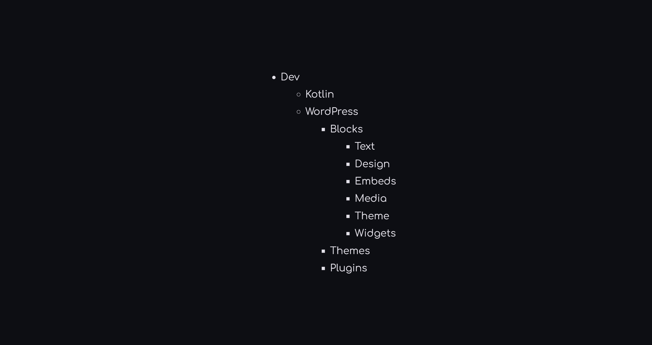

Block example

theme.json
Gallery
- core/gallery
| Category | Configuration |
|---|---|
| Color | background: Available gradient: Available text: — |
| Typography | fontSize: — lineHeight: — |
| Spacing | padding: Available margin: Available blockGap: Available* |
| Border | border: Available radius: Available |
| Filter | duotone: — |
| Shadow | — |
| Css | Available |
*blockGap is being overridden by –wp–style–gallery-gap-default rendering the setting ineffective
Possible fix:
"styles": {
    "css":root {
        --wp--style--gallery-gap-default: var(--wp--preset--spacing--small);
    }
}
Json example
"core/gallery": {
    "border": {
        "radius": {
            "bottomLeft": "var(--wp--preset--border-radius--extra-large-increased)",
            "bottomRight": "var(--wp--preset--border-radius--extra-large-increased)",
            "topLeft": "var(--wp--preset--border-radius--extra-large-increased)",
            "topRight": "var(--wp--preset--border-radius--extra-large-increased)"
        }
    },
    "css": "overflow: hidden;",
    "spacing": {
        "blockGap": "var(--wp--preset--spacing--small)",
        "margin": {
            "bottom": "0",
            "left": "0",
            "right": "0",
            "top": "0"
        },
        "padding": {
            "bottom": "0",
            "left": "0",
            "right": "0",
            "top": "0"
        }
    }
}